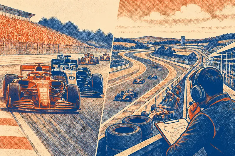
From Number Board to Racing Identity
Learn how to read racing numbers as visual identity, from practical identification and placement to the colors, shapes, and traditions around them.

The common mistake when reading a racing number is to treat it as decoration; that misses how it identifies a car and helps a team make its visual identity legible at speed. To understand racing numbers, start with the practical job of the number board, then follow the choices that turn a clear identifier into a familiar mark.
Start with the identifier
Before race numbers became a prominent part of a car’s appearance, their purpose was straightforward: distinguish competitors. Officials, marshals, commentators, and spectators needed a visible way to tell one machine from another, especially when cars were moving together or viewed from a distance.
A number works only if it can be seen quickly. That means contrast, uncluttered shapes, and a position that does not disappear behind a wheel, body panel, or other visual detail. A distinctive paint scheme may help, but it is not a dependable substitute: cars can share colors, and dirt or changing light can blur a livery’s finer features.
Start your own reading of a car by locating its number on the main visible surfaces. Look at the sides first, then the front and rear where the regulations or series design place them. Notice whether the number is printed directly on the body or contained in a contrasting panel. The arrangement tells you how the car balances identification with its broader design.
When watching a race, identify the number before relying on the paint scheme.
Read the placement
Number placement is a practical design decision, not an afterthought. A side panel can present a number clearly to spectators along the circuit, while a forward-facing display can help officials and viewers identify a car approaching or passing. The exact requirements vary by competition, so a team’s choices are shaped by the applicable rules.
Check how the number sits beside the cockpit, wheel arches, sponsor marks, and body seams. A cramped number may remain technically present but become harder to read when surrounded by lettering or broken across a panel edge. A well-integrated layout leaves the numeral intact and gives it enough visual separation to register at a glance.
Imagine you are designing a fictional club-racing car with a dark blue body and a large sponsor mark along each door. You could place a pale number panel ahead of that mark, keeping the numeral clear from the side without forcing the sponsor lettering to compete with it. The observable result would be a side view in which a viewer can identify the car and still distinguish its two main graphic elements.
Inspect the car from the angle a spectator or marshal is most likely to see.
Notice the visual grammar
Once placement is clear, look at the number itself. The typeface, stroke thickness, spacing, and shape of each digit influence whether it reads cleanly and whether it feels like part of the car’s character. A narrow numeral can suit a compact panel but may lose clarity against visual clutter; a heavier numeral can be easier to pick out, though it may dominate the surrounding design.
Color carries a similar double purpose. It separates the number from its background, while also linking it to the team’s palette or a particular era of its identity. Some designs use a plain, high-contrast number panel. Others set the digits directly into the livery. In either case, ask two questions: can you recognize the number quickly, and does its treatment look intentional alongside the rest of the car?
Pay attention to repeated choices across the vehicle. Matching numerals on the sides and nose create a consistent system; a special color or outline can make one digit stand out without changing the car’s overall scheme. Small variations may reflect a class distinction or an event rule, so avoid assuming that every visual difference is just a styling choice.
Clarity comes first; character is what makes a clear number memorable.
Follow the identity
A racing number can become familiar through repeated use. Fans may associate it with a driver, team, manufacturer, or a particular period in a team’s story. That association is built visually as well as competitively: the same numeral appearing in a stable position, with related colors and graphic treatment, can make different cars feel connected.
That identity is not always permanent. A number may be assigned according to series rules, chosen by a competitor where choice is allowed, or carried over as part of a team’s presentation. A car’s number can therefore identify its entry in one context while also serving as a recognizable piece of its design. The meaning depends on the competition and the traditions around it.
When comparing cars, separate what the number tells you officially from what it suggests visually. The official assignment identifies the entry under that series’ system. Its color, font, and placement may express a team’s design language, but those details alone do not establish a driver’s standing or a car’s technical class.
Look for continuity across a team’s cars, not just a single striking numeral.
Compare the traditions
Different forms of racing can treat numbers differently. A series may prescribe the location, size, or appearance of its identifiers; another may leave teams more room to integrate them into the livery. Endurance events can also ask viewers to distinguish cars sharing a team’s colors, while single-seater fields often make the number a compact, highly visible element of a tightly controlled body design.
Those differences affect how the number functions. A large contrasting panel favors immediate recognition. A subtler treatment can connect the number more closely to the livery, provided visibility remains adequate. Look at the cars within the same competition before judging a design: a format’s shared conventions help explain why one number looks traditional there and unusual elsewhere.
Rules and series instructions determine what teams may change. Treat the number’s assignment and required presentation as part of the competition’s own system, rather than assuming one universal convention.
What do racing numbers tell you?
Why are racing numbers displayed on cars?
They identify competitors for officials, teams, commentators, and spectators. Their visibility matters most when cars are close together or seen from a passing angle.
Does a racing number belong permanently to a driver?
Not in every competition. Number assignment and retention depend on the series’ rules, so the number may identify an entry for a season or event rather than a driver throughout a career.
Why do some cars use a contrasting number panel?
A contrasting panel separates the digits from the body color and surrounding graphics. It can improve recognition without requiring the rest of the livery to change.
Can a number become part of a team’s identity?
Yes. Repeated use of a number with familiar colors, typography, and placement can make it recognizable as part of a team’s visual presentation, even when the official assignment has a separate purpose.
Read a car in order
Use a simple viewing sequence when you encounter a new grid or team:
- Find the number on the side, then check the front or rear for another display.
- Judge contrast against the bodywork and look for graphics that interrupt the digits.
- Notice the font, outline, and panel shape that give the number its character.
- Compare its treatment with other cars in the same competition.
- Separate the official identifier from the visual associations built around it.
This sequence helps you see both jobs at once: the number must identify a car, and its design can make that car recognizable. Keep those functions distinct, and racing numbers become easier to read as more than digits on bodywork.
The next time a car flashes past, note where its number remains visible from your viewing angle. That small observation can tell you whether the design is serving the race first and expressing identity through the same clear mark.